
Pipeline Trend Visual
View the movement of subjects through multiple stages of a process over time.
The Pipeline Trend visual shows the movement of subjects through multiple stages of a process over time. Subjects can include people (for example, applicants) or things (for example, requisitions).
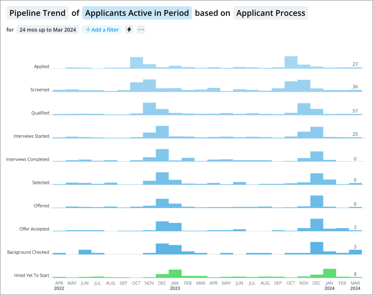
The vertical axis represents the different stages in a process. The stages are ordered sequentially with the start stage at the top of the chart and the end stage at the bottom of the chart. The horizontal axis represents units of time. Each row of the chart shows how the volume of subjects in each stage change over time. Data is presented as a series of vertical bars. Each bar shows the number of subjects in that stage at the specific interval (for example, week or month). Hover over an interval to view the subject counts for each stage at the end of that interval.
How to explore the visual to gain insight
- View a summary of the data in the Info panel by clicking a data point.
- Compare subject counts across different time periods to answer questions like:
- How quickly are subjects moving through each stage (for example, on a week to week basis)?
- At what stage are subjects dropping off or abandoning the process?
- Are there potential bottlenecks in the process?
- View a list of subjects who are at a stage. In the Info panel, click View Details.
- Generate a forecast based on the current state of the pipeline to predict when subjects will successfully complete the process. Based on the results, determine if subjects are moving through the process quickly enough to meet organization goals.
Tip:
Right-click on a chart item or data point to open the Visual Item Actions menu. Find actions that will allow you to quickly interact with points of interest. Actions include drilling up or down to view different levels of your data and accessing the Detailed View visual to see a list of subject members or event occurrences that make up a given population.
How to generate a forecast
- Click the Forecast button
 .
. - In the Forecast Settings panel, type the number of subjects you need to successfully complete the process in the Goal box.
- Optional: Add a filter to use data from a specific population to generate the forecast.
- Click Forecast.
Look in the Info panel to see:
- The estimated time period when the goal will be reached.
- The estimated total time it will take for the goal to be reached.
The solution generates forecasts for three different likelihoods: 30, 60, and 90 percent. The chart shows the estimated subject count of each stage for future periods. For more information about the technology behind the pipeline forecast, see Pipeline Forecast Visual.